We worked from the ground up, shaping the brand idea and translating it into a visual identity. Our process involved understanding the founders’ vision, the Nordic cultural context, and the symbolic depth behind the brand name — Gebo, a rune we reimagined for the business world with a human touch.
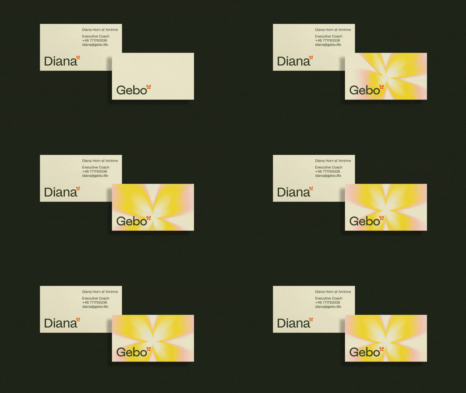
The visual identity centers around the Gebo rune, which we transformed into a butterfly — a symbol of transformation and self-discovery. The brand distances itself from traditional coaching aesthetics with a clean yet fluid visual system that allows space for movement and organic forms


← →